
What is Responsive Design?
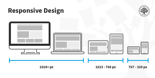
Responsive Design refers to an approach in web development that makes web pages render well on a variety of devices and screen sizes. With responsive design, a website or web application dynamically adjusts its layout, content, and features to provide an optimal viewing experience across different devices—whether it’s a desktop, tablet, or smartphone.
Responsive web design (RWD) is based on the fluid grid layout concept, where the layout elements are sized relative to the viewport. This ensures that the layout adapts and scales appropriately based on the screen size and resolution. Responsive design uses flexible grids, media queries, and flexible images to ensure that the layout works seamlessly on multiple devices without the need for separate versions of the site.
Key Principles of Responsive Design:
- Fluid Grid Layout: Instead of fixed-width layouts, responsive design uses percentage-based widths so that content resizes fluidly based on the screen size.
- Flexible Images: Images and media assets are resized using CSS to prevent them from breaking the layout on smaller screens.
- Media Queries: Media queries allow designers to apply different styles based on the screen’s characteristics, such as width, height, resolution, and orientation.
With responsive design, developers can create websites that are mobile-friendly, tablet-compatible, and optimized for larger screens without duplicating content for each device.
What Are the Major Use Cases of Responsive Design?
Responsive design is widely used in various scenarios to provide a seamless user experience across devices. Below are some of the major use cases for responsive design:
1. Mobile-Friendly Websites:
- Use Case: As the number of mobile users continues to grow, having a mobile-friendly website is critical. Responsive design ensures that websites look great and function well on both smartphones and tablets.
- Example: An e-commerce website using responsive design will automatically adjust its layout to fit the small screen of a mobile device, providing easy navigation, quick access to product details, and a smooth checkout process.
- Why Responsive Design? Mobile traffic now accounts for a significant portion of all web traffic. Websites that aren’t optimized for mobile devices risk losing visitors and customers. Responsive design solves this problem.
2. Cross-Device Compatibility:
- Use Case: Websites must support a wide range of devices, including smartphones, tablets, desktops, and laptops. Responsive design ensures that websites deliver a consistent experience regardless of device type or screen size.
- Example: A news website that adapts its layout based on the screen size, allowing easy readability and intuitive navigation on both large desktop monitors and small mobile screens.
- Why Responsive Design? With the increasing number of devices and screen resolutions, developers need a single, flexible solution to ensure their website works across platforms without building separate versions.
3. SEO Benefits:
- Use Case: Responsive design can improve a website’s SEO performance. Google prefers mobile-friendly websites because they offer a better user experience and are easier to index.
- Example: A local business website that adapts to both desktop and mobile will rank better in search results for local searches and attract more mobile customers.
- Why Responsive Design? Having a single, responsive URL for all devices makes it easier for search engines to index and rank your site, leading to better search engine optimization (SEO).
4. E-Commerce and Digital Services:
- Use Case: For online stores or service-based websites, responsive design ensures that customers have an optimized experience, whether they’re shopping from a desktop, tablet, or phone.
- Example: A shopping website that provides an optimized mobile experience, offering zoomable images, swiping product carousels, and a clean checkout flow.
- Why Responsive Design? Conversion rates improve when customers can easily browse and make purchases on any device. With responsive design, an online store can cater to mobile users without compromising the desktop experience.
5. Content-heavy Websites:
- Use Case: Websites with a lot of content, like blogs, news websites, and documentation sites, benefit greatly from responsive design because it allows the content to adapt to different screen sizes, improving readability and navigation.
- Example: A blog that automatically adjusts text size, line spacing, and image layout for different devices.
- Why Responsive Design? Content-heavy websites are frequently visited on mobile devices. Responsive design helps ensure that users can easily read, navigate, and interact with content regardless of screen size.
How Responsive Design Works Along with Architecture?
Responsive design works by utilizing a combination of fluid grids, media queries, and flexible images. Below is an explanation of how these components fit together in the architecture of a responsive website:
1. Fluid Grid Layout:
- Instead of using fixed-width layouts with set pixel values, fluid grids use percentages to define the layout’s structure. This allows the layout to scale proportionally with the browser window.
- Example: Instead of setting a column to be 300px wide, a fluid grid sets the column width to 25%, allowing it to resize depending on the screen width.
- How It Works: A responsive grid layout allows elements to adjust their width relative to the screen size, ensuring that content looks good on screens of any size.
2. Media Queries:
- Media queries are the backbone of responsive design. They allow developers to apply different styles based on the device’s width, height, resolution, and orientation.
- Example: The following media query adjusts the layout for devices with a screen width smaller than 600px (typically smartphones):
@media only screen and (max-width: 600px) {
  body {
    font-size: 16px;
  }
  .main-content {
    padding: 10px;
  }
}
Code language: CSS (css)- How It Works: When the screen size reaches a certain threshold (e.g., under 600px), the styles defined inside the media query are applied, adjusting the website’s layout for optimal display on smaller screens.
3. Flexible Images:
- Flexible images ensure that images scale appropriately on various devices. This is achieved by using CSS rules like
max-width: 100%andheight: autoto make images responsive to different screen sizes. - Example: Instead of using a fixed-width image, a responsive image will automatically adjust its size to fit the screen:
img {
  max-width: 100%;
  height: auto;
}
Code language: CSS (css)- How It Works: This rule ensures that images don’t overflow the layout, and instead, they resize themselves according to the width of the parent container, maintaining aspect ratio.
4. Mobile-first Approach:
- Responsive design often follows a mobile-first approach, where styles are initially designed for smaller screens (e.g., smartphones), and then additional styles are added for larger screens (e.g., tablets, desktops).
- Example: The default CSS for small screens is written first, and then media queries are used to add styles for larger screens.
- How It Works: Mobile-first ensures that the website is optimized for the most constrained devices first and then progressively enhanced for devices with more resources.
What Are the Basic Workflow of Responsive Design?
The basic workflow for implementing responsive design involves several key steps to ensure that your website adapts to different devices seamlessly:
1. Plan and Design for Multiple Devices:
- The first step is to understand the range of devices and screen sizes your audience uses. Use analytics tools to determine the most common screen sizes for your users.
- Sketch or wireframe the layout for different devices. Tools like Figma, Sketch, or Adobe XD can help you create responsive designs for various breakpoints (e.g., mobile, tablet, desktop).
2. Start with a Mobile-first Approach:
- Begin designing the website for the smallest screen size first (usually smartphones). Apply styles that work well for these constrained devices, ensuring that the content is readable, navigation is intuitive, and images are optimized.
- Use flexible grids and responsive typography to ensure that the layout scales smoothly.
3. Implement Fluid Grids and Layouts:
- Use percentage-based widths for elements instead of fixed pixel values. This makes the layout flexible, allowing it to expand or contract based on the screen size.
- Ensure that containers, columns, and other layout components adjust dynamically.
4. Use Media Queries to Target Different Devices:
- Once the mobile layout is in place, use media queries to apply different styles for larger screens, such as tablets and desktops.
- For example, you might increase the size of images or change the number of columns on larger screens.
5. Test Responsiveness:
- Test your website on multiple devices or use browser tools to simulate different screen sizes. Ensure that the layout, images, and text adapt properly on each device.
- Browser developer tools (e.g., Chrome DevTools) have built-in functionality to test responsiveness on various screen sizes.
6. Optimize Images and Content:
- Make sure that images are responsive and optimized for various screen sizes to reduce load times. Use modern formats like WebP for smaller file sizes.
- Consider using responsive images with the
srcsetattribute for different screen resolutions and sizes.
7. Continuous Improvement:
- Responsive design is an ongoing process. Continuously monitor and test how your website performs on different devices, and optimize it for new screen sizes and user behaviors.
- Stay updated with best practices and emerging trends in responsive design.
Step-by-Step Getting Started Guide for Responsive Design
Step 1: Set up Your Development Environment
- Choose a text editor (e.g., VS Code, Sublime Text) or an IDE for writing HTML, CSS, and JavaScript.
- Make sure you have the browser developer tools enabled for easy testing of responsive behavior.
Step 2: Create a Basic HTML Template
- Start with a basic HTML structure, ensuring that you use semantic tags for accessibility and SEO.
- Example:
<!DOCTYPE html>
<html lang="en">
<head>
  <meta charset="UTF-8">
  <meta name="viewport" content="width=device-width, initial-scale=1.0">
  <title>Responsive Design</title>
</head>
<body>
  <header>
    <h1>Welcome to My Responsive Website</h1>
  </header>
  <main>
    <section>
      <p>This is a simple, responsive design example.</p>
    </section>
  </main>
</body>
</html>
Code language: HTML, XML (xml)
Step 3: Add Basic CSS for Mobile-first Design
- Write basic CSS for mobile devices, ensuring that text is readable and layout works well.
- Example:
body {
  font-family: Arial, sans-serif;
  margin: 0;
  padding: 0;
}
header {
  background-color: #333;
  color: white;
  text-align: center;
  padding: 20px;
}
Code language: CSS (css)
Step 4: Implement Media Queries
- Add media queries to apply different styles for larger screens.
- Example:
@media only screen and (min-width: 600px) {
  body {
    background-color: #f0f0f0;
  }
  header {
    font-size: 1.5rem;
  }
}
Code language: CSS (css)
Step 5: Test Responsiveness
- Use browser tools to test how the layout adapts to different screen sizes.
- Refine and adjust layout, fonts, and images based on testing feedback.