What is CSS?
CSS (Cascading Style Sheets) is a style sheet language used to describe the visual presentation of HTML content on web pages. While HTML is responsible for defining the structure and content of a webpage, CSS is responsible for styling—including layout, colors, fonts, spacing, responsiveness, and animations. CSS was introduced by the World Wide Web Consortium (W3C) in 1996 to separate content from presentation, a principle that continues to guide front-end development today.
Modern CSS is powerful, flexible, and essential for web design. From static pages to complex, responsive interfaces, CSS is used to create aesthetically pleasing and accessible web experiences. It supports a wide variety of features such as grid and flexbox layouts, media queries for responsive design, animations and transitions, and custom properties (CSS variables).
CSS is also modular. Developers can organize styles in external files, reuse them across projects, and override them as needed using its cascading and specificity rules. Whether you’re building a personal website or a large-scale application UI, CSS is the language that ensures it looks and feels great.
What are the Major Use Cases of CSS?
CSS is essential for any digital product viewed through a browser. Its main use cases include:
🔹 1. Web Page Styling
The most basic use of CSS is to apply consistent styling across a website—setting fonts, colors, padding, margins, and more. It helps establish visual hierarchy and brand identity.
🔹 2. Responsive Web Design
CSS enables web pages to adapt to different screen sizes using media queries. This makes websites functional and visually appealing on desktops, tablets, and mobile phones.
🔹 3. Layout Management
Modern CSS layout systems like Flexbox and CSS Grid allow developers to create sophisticated, multi-column and nested layouts with precise control over spacing and alignment.
🔹 4. Animations and Transitions
CSS offers native support for transitions (e.g., hover effects) and keyframe-based animations. These tools allow for smooth, performant visual effects without needing JavaScript.
🔹 5. Theme Customization
CSS makes it easy to define site-wide design themes using variables, which can be dynamically updated via JavaScript or pre-processed using tools like SASS.
🔹 6. Accessibility and Readability
CSS plays a key role in improving readability, contrast, and accessibility—for example, by using relative units, increasing line height, and enabling focus styles.
🔹 7. Component Styling in Web Apps
In component-based frameworks like React, Vue, and Angular, CSS (or its variants like CSS-in-JS, SCSS) is used to style UI components consistently and modularly.

How CSS Works Along with Architecture
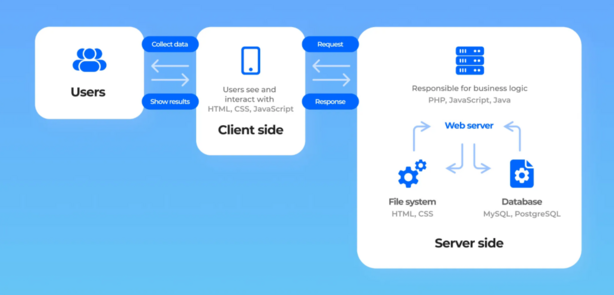
CSS is not a programming language, but a rule-based language that works hand-in-hand with HTML and the browser’s rendering engine. Here’s how it works at an architectural level:
🔸 1. CSS Syntax and Selectors
A CSS rule consists of a selector (which HTML element to style) and a declaration block (how to style it). For example:
h1 {
  color: blue;
  font-size: 2rem;
}
Code language: CSS (css)
CSS uses various types of selectors, including class selectors (.box), ID selectors (#header), attribute selectors, pseudo-classes (:hover, :focus), and more.
🔸 2. Cascading and Specificity
When multiple CSS rules apply to the same element, the browser decides which one to apply using:
- Specificity (ID > Class > Element)
- Order of appearance
- !important declarations
This “cascading” model gives developers powerful control but requires awareness of rule hierarchy.
🔸 3. Box Model
Every element is rendered as a rectangular box made up of:
- Content
- Padding
- Border
- Margin
Understanding the box model is key to layout and spacing.
🔸 4. Rendering Flow
- The browser parses the HTML and builds the DOM (Document Object Model).
- It parses the CSS and builds the CSSOM (CSS Object Model).
- It combines both into a Render Tree.
- Then it lays out the page and paints it on the screen.
🔸 5. Layout Systems
- Flexbox: 1D layout system for rows or columns.
- Grid: 2D layout system for aligning items both vertically and horizontally.
These modern tools replace older hacks like float-based layouts.
What is the Basic Workflow of CSS?
The typical workflow for working with CSS in a project involves several steps and best practices:
- Structure the HTML: Build your semantic content and assign
classoridattributes as needed. - Create a CSS File: Use
.cssfiles to define styles separately from content. - Link the CSS File: Reference the stylesheet in the HTML
<head>using<link>tags. - Define a Layout: Use layout systems (Flexbox or Grid) to structure sections of your page.
- Apply Styling: Define colors, fonts, spacing, and interactive styles (like hover effects).
- Use Responsive Design: Add media queries to adjust layouts and fonts for different devices.
- Test and Debug: Use browser developer tools (F12) to inspect elements, debug styles, and refine layout.
- Optimize and Deploy: Minify your CSS for production using tools like PostCSS or a build process.
In modern projects, CSS is often enhanced using pre-processors like SASS/SCSS, utility-first frameworks like Tailwind CSS, or in-line scoped styles via CSS-in-JS.
Step-by-Step Getting Started Guide for CSS
✅ Step 1: Create HTML and CSS Files
Create two files: index.html and style.css.
index.html
<!DOCTYPE html>
<html lang="en">
<head>
  <meta charset="UTF-8">
  <title>My First CSS Page</title>
  <link rel="stylesheet" href="style.css">
</head>
<body>
  <h1>Hello, CSS World!</h1>
  <p>This is a paragraph styled with CSS.</p>
</body>
</html>
Code language: HTML, XML (xml)
style.css
body {
  font-family: Arial, sans-serif;
  background-color: #f4f4f4;
  color: #333;
  padding: 20px;
}

h1 {
  color: #0077cc;
  text-align: center;
}

p {
  font-size: 18px;
  line-height: 1.6;
}
Code language: CSS (css)
✅ Step 2: Add a Layout with Flexbox
.container {
  display: flex;
  justify-content: space-between;
  align-items: center;
}
Code language: CSS (css)
Use this class on a div to align items horizontally.
✅ Step 3: Add Responsive Design
@media (max-width: 600px) {
  h1 {
    font-size: 1.5rem;
  }
}
Code language: CSS (css)
✅ Step 4: Add a Hover Effect
a:hover {
  color: red;
  text-decoration: underline;
}
Code language: CSS (css)
✅ Step 5: Use Google Fonts
<link href="https://fonts.googleapis.com/css2?family=Roboto&display=swap" rel="stylesheet">
Code language: HTML, XML (xml)
body {
font-family: 'Roboto', sans-serif;
}
Code language: CSS (css)✅ Step 6: Explore Frameworks
- Bootstrap: Prebuilt UI components and grid system.
- Tailwind CSS: Utility-first, highly customizable.
- SASS: Preprocessor for variables, nesting, mixins, etc.