Are you tired of sifting through piles of data without being able to make sense of it all? Do you find yourself struggling to communicate your findings to others? Look no further than data visualization tools!
In this article, we’ll explore the world of data visualization tools, from the basics to the advanced. Let’s dive in!
What are Data Visualization Tools?
Data visualization tools are software applications that allow you to turn raw data into easy-to-understand visual representations. These tools use charts, graphs, and other visual aids to help you make sense of your data and communicate your findings to others.
Understanding Data Visualization
Before we delve into data visualization tools, it’s important to understand what data visualization is all about. In simplest terms, data visualization is the graphical representation of data and information. It involves the use of charts, graphs, and other visual aids to help people make sense of complex data sets.
Why Use Data Visualization Tools?
Now that we know what data visualization is, let’s explore why we need data visualization tools. The answer is simple – to make sense of data! With the amount of data being generated every day, it’s impossible to make sense of it all without the help of data visualization tools. These tools help us to identify patterns, trends, and outliers in data sets that might otherwise be difficult to spot.
Types of Data Visualization Tools
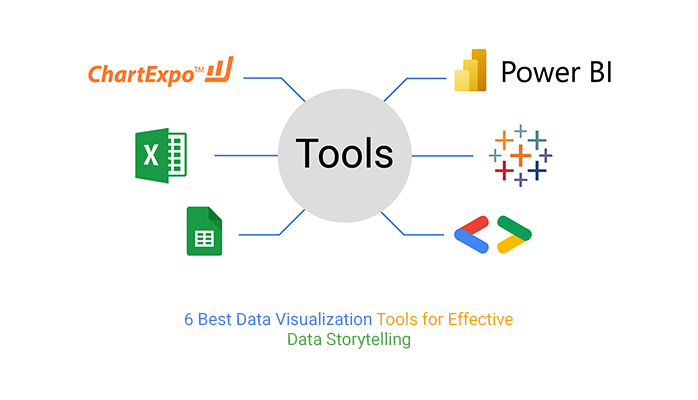
There are many different types of data visualization tools available, each with its own unique set of features and benefits. Here are just a few examples:
Charts and Graphs
Charts and graphs are perhaps the most common types of data visualization tools. They are used to display numerical data in a clear and concise way, making it easy to spot trends and patterns. Examples of charts and graphs include bar charts, line graphs, scatter plots, and pie charts.
Maps
Maps are another popular type of data visualization tool, particularly when it comes to geographic data. They can be used to display a wide range of information, from population density to weather patterns.
Infographics
Infographics are a combination of text, images, and data visualizations. They are often used to communicate complex information in a way that is easy to understand and engaging for the reader.
Benefits of Data Visualization Tools
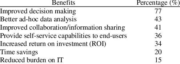
So, why should you use data visualization tools? Here are just a few of the many benefits:
Improved Understanding
By using data visualization tools, you can gain a better understanding of complex data sets. Visual aids make it easier to spot patterns and trends, and can help you to draw more meaningful conclusions from your data.
Increased Engagement
Data visualization tools can help to make your data more engaging and interesting. By presenting information in a visually appealing way, you can capture the attention of your audience and keep them interested in your message.
Better Decision-Making
When you can see your data in a graphical format, it becomes easier to make informed decisions based on that data. By using data visualization tools, you can identify trends and outliers that might otherwise be difficult to spot, allowing you to make better decisions for your business or organization.
Conclusion
In conclusion, data visualization tools are an essential part of any data analysis toolkit. They help us to make sense of complex data sets, identify patterns and trends, and make informed decisions based on that data. Whether you’re a business owner, a data analyst, or just someone who loves numbers, data visualization tools are a valuable resource that shouldn’t be overlooked.