MOTOSHARE 🚗🏍️
Turning Idle Vehicles into Shared Rides & Earnings
From Idle to Income. From Parked to Purpose.
Earn by Sharing, Ride by Renting.
Where Owners Earn, Riders Move.
Owners Earn. Riders Move. Motoshare Connects.
With Motoshare, every parked vehicle finds a purpose.
Owners earn. Renters ride.
🚀 Everyone wins.
Introduction
In 2025, data visualization tools have become essential for businesses, researchers, educators, and professionals who want to turn complex datasets into clear, actionable insights. With the increasing volume of big data, AI-driven analytics, and real-time decision-making, visualization tools empower users to understand trends, patterns, and correlations effortlessly.
Modern visualization tools go beyond static charts and graphs; they offer interactive dashboards, predictive analytics, AI-powered insights, and collaborative reporting. Whether you’re a data analyst, business owner, marketer, or developer, choosing the right tool can significantly impact your workflow and decision-making.
In this guide, we explore the top 10 visualization tools in 2025, comparing their features, pros, cons, pricing, and suitability for different users.
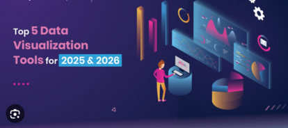
Top 10 Visualization Tools in 2025
1. Tableau
Description:
Tableau is a leading data visualization and business intelligence platform trusted by enterprises worldwide. It offers powerful analytics, intuitive dashboards, and seamless integrations.
Key Features:
- Drag-and-drop visualization builder
- AI-powered insights and forecasting
- Integration with 100+ data sources
- Interactive dashboards and reports
- Real-time analytics and collaboration
Pros:
- Extremely user-friendly
- Strong community and learning resources
- Advanced data blending capabilities
Cons:
- High licensing costs
- Steeper learning curve for complex analytics
2. Microsoft Power BI
Description:
Microsoft Power BI is an affordable, feature-rich visualization tool ideal for businesses of all sizes. It integrates seamlessly with Microsoft 365 and Azure services.
Key Features:
- AI-driven insights and natural language queries
- Embedded analytics for apps and websites
- Wide range of visualization templates
- Real-time reporting and sharing
- Tight integration with Excel and Microsoft Teams
Pros:
- Cost-effective solution
- Ideal for Microsoft ecosystem users
- Continuous feature upgrades
Cons:
- Requires Microsoft ecosystem for best use
- Limited advanced custom visualizations
3. Qlik Sense
Description:
Qlik Sense combines data discovery, visualization, and analytics into a single platform, making it ideal for large enterprises and advanced analytics teams.
Key Features:
- Associative data engine for faster insights
- AI-enhanced analytics
- Interactive storytelling dashboards
- Smart search functionality
- Self-service data preparation
Pros:
- Highly flexible and scalable
- Great for advanced analytics teams
- Strong associative data modeling
Cons:
- Expensive for small businesses
- Steeper learning curve
4. Looker (Google Cloud)
Description:
Acquired by Google, Looker is a powerful visualization and business intelligence tool, offering data modeling and deep integration with Google Cloud services.
Key Features:
- LookML for custom data modeling
- Interactive dashboards
- Native integration with BigQuery
- AI-powered predictive analytics
- Embedded analytics for apps and portals
Pros:
- Seamless Google Cloud integration
- Highly customizable data models
- Excellent for large-scale data operations
Cons:
- Complex setup for beginners
- Costly for small to mid-sized businesses
5. Domo
Description:
Domo is a cloud-native business intelligence platform with real-time dashboards and collaborative data visualization features designed for fast-moving teams.
Key Features:
- AI-powered insights and predictions
- Drag-and-drop dashboard creation
- Integration with 1,000+ data sources
- Mobile-first analytics experience
- Collaboration and workflow automation
Pros:
- Great for mobile reporting
- Excellent data connectivity options
- Smooth collaboration features
Cons:
- Premium pricing
- Limited advanced customization
6. Sisense
Description:
Sisense specializes in embedded analytics and customizable dashboards, allowing organizations to integrate visualizations directly into their products.
Key Features:
- In-chip data processing for faster queries
- AI-driven predictive modeling
- White-label dashboards
- Advanced API integrations
- Seamless data prep and ETL
Pros:
- Excellent for SaaS and product teams
- Strong embedded analytics
- High-performance dashboards
Cons:
- Complex setup for beginners
- Costly for small teams
7. Zoho Analytics
Description:
Zoho Analytics is an affordable visualization and BI tool ideal for startups and SMEs. It offers AI-powered analytics and integrates seamlessly with other Zoho apps.
Key Features:
- Drag-and-drop dashboard builder
- AI-powered conversational analytics
- Pre-built templates and widgets
- Real-time sharing and collaboration
- Integration with 500+ apps
Pros:
- Cost-effective solution
- Great for Zoho ecosystem users
- Simple and user-friendly
Cons:
- Limited advanced analytics
- Not ideal for very large datasets
8. Google Data Studio (Looker Studio)
Description:
Google’s Looker Studio (formerly Data Studio) is a free visualization tool ideal for marketers, analysts, and businesses using Google services.
Key Features:
- Pre-built Google integrations (Analytics, Ads, Sheets)
- Customizable dashboards
- Collaboration and sharing tools
- Support for third-party data connectors
- Free and cloud-based
Pros:
- Completely free
- Seamless integration with Google products
- Intuitive for beginners
Cons:
- Limited advanced visualization options
- Dependent on Google ecosystem
9. Klipfolio
Description:
Klipfolio is a real-time dashboard and visualization platform designed for startups and small businesses seeking a cost-effective analytics solution.
Key Features:
- Pre-built data visualization widgets
- Real-time dashboard updates
- 100+ integrations
- AI-enhanced analytics
- White-label reporting
Pros:
- Affordable pricing
- Excellent for small teams
- Easy-to-use drag-and-drop interface
Cons:
- Limited enterprise-level features
- Smaller community compared to rivals
10. Chartio (Atlassian)
Description:
Chartio, now part of Atlassian, offers self-service BI and data visualization for teams that want quick insights without heavy coding.
Key Features:
- Drag-and-drop interface
- SQL query editor for advanced users
- Multi-dataset dashboards
- Embedded analytics
- Collaboration and sharing options
Pros:
- Ideal for small to mid-sized teams
- Easy-to-use interface
- Flexible for both beginners and developers
Cons:
- Limited AI-driven features
- Pricing on the higher side
Comparison Table
| Tool Name | Best For | Platforms | Standout Feature | Pricing | Avg. Rating |
|---|---|---|---|---|---|
| Tableau | Enterprises, analysts | Web, Desktop | AI-powered insights | Starts at $70/user | 4.7/5 |
| Power BI | SMBs & Enterprises | Web, Desktop | Seamless MS integration | Free / $10/user | 4.6/5 |
| Qlik Sense | Enterprises | Web, Desktop | Associative data engine | Custom pricing | 4.5/5 |
| Looker | Cloud-first companies | Web | Deep Google integration | Custom pricing | 4.5/5 |
| Domo | Agile teams | Web, Mobile | Real-time dashboards | Starts at $83/user | 4.4/5 |
| Sisense | SaaS teams | Web | Embedded analytics | Custom pricing | 4.5/5 |
| Zoho Analytics | SMEs & Startups | Web, Desktop | AI-driven reporting | Starts at $24/month | 4.4/5 |
| Looker Studio | Marketers, analysts | Web | Free Google integration | Free | 4.3/5 |
| Klipfolio | Startups | Web, Mobile | Real-time dashboards | Starts at $49/month | 4.2/5 |
| Chartio | SMEs & Developers | Web | Self-service BI | Custom pricing | 4.3/5 |
Which Visualization Tool is Right for You?
- For Enterprises & Complex Data: Tableau, Qlik Sense, Looker
- For Microsoft Ecosystem Users: Power BI
- For Startups & SMEs: Zoho Analytics, Klipfolio
- For Marketing Teams: Google Looker Studio
- For SaaS Products: Sisense, Domo
- For Developers: Chartio
Conclusion
Visualization tools in 2025 are more intelligent, integrated, and accessible than ever. From AI-powered insights to collaborative dashboards, the right tool can help you unlock the potential of your data and make informed decisions faster.
Before choosing, assess your budget, data complexity, and ecosystem. Most tools offer free trials or demos — take advantage of them to find the best fit.
FAQs
Q1. What are visualization tools used for?
They transform complex data into charts, dashboards, and insights to make decision-making easier.
Q2. Which visualization tool is best for beginners?
Google Looker Studio and Zoho Analytics are great for beginners due to their simplicity and affordability.
Q3. What’s the difference between Power BI and Tableau?
Power BI is more cost-effective and integrates deeply with Microsoft products, while Tableau offers advanced analytics and customization.
Q4. Are there free visualization tools available?
Yes, Google Looker Studio and the free version of Microsoft Power BI are popular choices.
Q5. Which tool is best for enterprises?
Tableau, Qlik Sense, and Looker are the top choices for enterprise-level data visualization needs.