MOTOSHARE 🚗🏍️
Turning Idle Vehicles into Shared Rides & Earnings
From Idle to Income. From Parked to Purpose.
Earn by Sharing, Ride by Renting.
Where Owners Earn, Riders Move.
Owners Earn. Riders Move. Motoshare Connects.
With Motoshare, every parked vehicle finds a purpose.
Owners earn. Renters ride.
🚀 Everyone wins.
What is Matplotlib?
Matplotlib is a widely used open-source plotting library for the Python programming language. It provides a flexible and comprehensive set of tools for creating static, interactive, and animated visualizations in Python. Developed initially by John D. Hunter in 2003, Matplotlib has become the de facto standard for generating plots and charts in the Python ecosystem.
Matplotlib is particularly powerful for creating publication-quality figures in a variety of formats and interactive environments across platforms. It supports a wide range of plots, including line charts, bar graphs, scatter plots, histograms, heatmaps, 3D plots, and more.
At its core, Matplotlib provides a MATLAB-like interface called pyplot that simplifies the process of plotting by providing functions that closely mimic MATLAB’s plotting functions.
What Are the Major Use Cases of Matplotlib?
Matplotlib is used extensively in various domains, especially where data analysis and visualization are critical. Some major use cases include:
1. Exploratory Data Analysis (EDA)
- Analysts use Matplotlib to visualize data distributions, identify patterns, outliers, and relationships among variables before applying machine learning or statistical models.
2. Scientific Research and Publications
- Researchers generate high-quality graphs for academic papers, presentations, and reports. Matplotlib’s fine control over figure elements helps meet publication standards.
3. Data Reporting and Dashboards
- Matplotlib is integrated with tools like Jupyter Notebooks and web frameworks to create dynamic reports and dashboards for monitoring business KPIs or scientific experiments.
4. Education and Learning
- Widely used in teaching data science, statistics, and programming, Matplotlib helps learners visualize abstract concepts interactively.
5. Financial Analysis
- Plotting stock prices, moving averages, and financial indicators to analyze market trends and inform trading strategies.
6. Machine Learning and AI
- Visualizing training progress, loss curves, confusion matrices, and model predictions to better understand and improve models.
7. Geospatial Data Visualization
- While specialized libraries exist for maps, Matplotlib is often combined with tools like Basemap or Cartopy to visualize spatial data.
How Matplotlib Works Along with Architecture
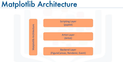
Matplotlib’s architecture is designed to be modular, flexible, and extensible, allowing it to support a wide variety of plotting backends and output formats.
Core Components of Matplotlib Architecture:
- Backend Layer
- Responsible for rendering the visual output. Backends can be interactive (e.g., Tkinter, Qt, WX) or non-interactive (e.g., PDF, SVG, PNG).
- The backend handles drawing commands and outputs the figure to the screen or file.
- Artist Layer
- The heart of Matplotlib is the Artist hierarchy. An Artist is anything that can be drawn on a figure: text, lines, shapes, images, and axes.
- Artists are organized hierarchically, with Figure as the root, containing Axes, which in turn contain multiple other artists.
- Scripting Layer (Pyplot)
- Provides a MATLAB-like procedural interface for creating figures and plots. This layer is designed for ease of use and quick prototyping.
- Functions like
plot(),scatter(), andhist()allow users to generate common plots quickly.
- Figure and Axes
- A Figure is the overall window or page that contains one or more Axes (plots). Each Axes is an area where data is plotted.
- This separation allows multiple plots within the same figure.
- Data Layer
- Users provide data in the form of lists, NumPy arrays, Pandas DataFrames, or other iterable structures that the plotting functions consume.
Workflow in Matplotlib
- When a plotting function is called, it creates or updates a Figure and Axes.
- Artists representing plot elements (lines, points, labels) are created.
- The backend then renders these artists to display the plot or save it to a file.
Matplotlib’s modular backend system allows it to work seamlessly across different platforms and output devices.
What Are the Basic Workflows of Matplotlib?
Using Matplotlib typically follows this general workflow:
- Import Matplotlib and Prepare Data
- Load the Matplotlib library, commonly via
import matplotlib.pyplot as plt. - Prepare data, usually using Python lists, NumPy arrays, or Pandas DataFrames.
- Load the Matplotlib library, commonly via
- Create a Figure and Axes
- Either implicitly create a figure by calling a plotting function, or explicitly create with
plt.figure()andfig.add_subplot().
- Either implicitly create a figure by calling a plotting function, or explicitly create with
- Plot Data
- Use pyplot functions like
plt.plot(),plt.scatter(), orplt.bar()to create visualizations. - Customize plot elements like colors, labels, legends, and titles.
- Use pyplot functions like
- Customize and Enhance
- Add gridlines, change axis limits, annotate points, or apply styles.
- Display or Save the Plot
- Display the plot on screen using
plt.show(). - Save to file using
plt.savefig('filename.png').
- Display the plot on screen using
- Close the Figure (optional)
- Free resources with
plt.close()especially when generating many plots programmatically.
- Free resources with
Step-by-Step Getting Started Guide for Matplotlib
Step 1: Installation
Install Matplotlib via pip:
pip install matplotlib
Or, install via Anaconda for scientific Python distribution:
conda install matplotlib
Step 2: Basic Plotting
Create your first simple line plot:
import matplotlib.pyplot as plt

x = [1, 2, 3, 4, 5]
y = [2, 3, 5, 7, 11]

plt.plot(x, y)
plt.title("Simple Line Plot")
plt.xlabel("X-axis")
plt.ylabel("Y-axis")
plt.show()
Code language: JavaScript (javascript)
Step 3: Explore Different Plot Types
- Scatter plot:
plt.scatter(x, y) plt.show() - Bar chart:
plt.bar(x, y) plt.show() - Histogram:
data = [1,2,2,3,3,3,4,4,5] plt.hist(data, bins=5) plt.show()
Step 4: Customize Your Plot
- Add labels and legends:
plt.plot(x, y, label='Prime Numbers') plt.legend() plt.grid(True) plt.show()
Step 5: Save Your Figure
- Save as PNG or PDF:
plt.savefig('myplot.png')
Step 6: Work with Subplots
Create multiple plots in one figure:
fig, axs = plt.subplots(2, 1)
axs[0].plot(x, y)
axs[1].bar(x, y)
plt.show()