Scaffold is a class in flutter which provides many widgets or we can say APIs like Drawer, Snack-Bar, Bottom-Navigation-Bar, Floating-Action-Button, App-Bar, etc. Scaffold will expand or occupy the whole device screen. It will occupy the available space. Scaffold will provide a framework to implement the basic material design layout of the application.
The class Hierarchy is as follows:
Object
 ↳ Diagnosticable
   ↳ Diagnosticable Tree
     ↳ Widget
       ↳ StateFul Widget
         ↳ Scaffold
Constructor of the Scaffold class:
const Scaffold({
    Key key,
    this.appBar,
    this.body,
    this.floatingActionButton,
    this.floatingActionButtonLocation,
    this.floatingActionButtonAnimator,
    this.persistentFooterButtons,
    this.drawer,
    this.endDrawer,
    this.bottomNavigationBar,
    this.bottomSheet,
    this.backgroundColor,
    this.resizeToAvoidBottomPadding,
    this.resizeToAvoidBottomInset,
    this.primary = true,
    this.drawerDragStartBehavior
          = DragStartBehavior.start,
    this.extendBody = false,
    this.drawerScrimColor,
})Code language: JavaScript (javascript)
Properties of Scaffold Class:
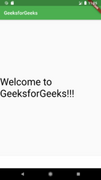
- app-Bar: It displays a horizontal bar which mainly placed at the top of the Scaffold. appBar uses the widget AppBar which has its own properties like elevation, title, brightness, etc.
Widget build(BuildContext context)
{
return Scaffold(
	appBar: AppBar(
	title: const Text('GeeksforGeeks'),
	),
Code language: JavaScript (javascript)
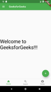
- body: It will display the main or primary content in the Scaffold. It is below the appBar and under the floatingActionButton. The widgets inside the body are at the left-corner by default.
Example:
Widget build(BuildContext context) {
return Scaffold(
	appBar: AppBar(title: const Text('GeeksforGeeks')),
	body: const Center(
	child: Text(
		"Welcome to GeeksforGeeks!!!",
		style: TextStyle(
		color: Colors.black,
		fontSize: 40.0,
		),
	),
	),
);
}
Code language: JavaScript (javascript)
In this example, we have displayed the text Welcome to GeeksforGeeks!!! in the body. We have displayed the text in the center of the page using Center widget. For styling the text, we have used TextStyle widget.
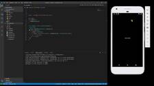
- floatingActionButton: FloatingActionButton is a button that is placed at the right bottom corner by default. FloatingActionButton is an icon button that floats over the content of the screen at a fixed place. If we scroll the page its position won’t change, it will be fixed.
Widget build(BuildContext context) {
return Scaffold(
	appBar: AppBar(title: const Text('GeeksforGeeks')),
	body: const Center(
	child: Text(
		"Welcome to GeeksforGeeks!!!",
		style: TextStyle(
		color: Colors.black,
		fontSize: 40.0,
		),
	),
	),
	floatingActionButton: FloatingActionButton(
	elevation: 10.0,
	child: const Icon(Icons.add),
	onPressed: () {
		// action on button press
	},
	),
);
}
Code language: JavaScript (javascript)
Here the elevation property is used to give a shadow effect to the button. Icon is used to put the icon of the button using some preloaded icons in flutter SDK. The onPressed() is a function that will be called when the button is pressed and the statements inside the function will be executed.

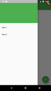
- drawer: drawer is a slider menu or a panel which is displayed at the side of the Scaffold. The user has to swipe left to right or right to left according to the action defined to access the drawer menu. In the Appbar, an appropriate icon for the drawer is set automatically at a particular position. The gesture to open the drawer is also set automatically. It is handled by the Scaffold.
Example:
drawer: Drawer(
child: ListView(
	children: const <Widget>[
	DrawerHeader(
		decoration: BoxDecoration(
		color: Colors.green,
		),
		child: Text(
		'GeeksforGeeks',
		style: TextStyle(
			color: Colors.green,
			fontSize: 24,
		),
		),
	),
	ListTile(
		title: Text('Item 1'),
	),
	ListTile(
		title: Text('Item 2'),
	),
	],
),
),
Code language: JavaScript (javascript)
As a parent widget we took ListView and inside it, we divided the panel into two parts, Header and Menu.DrawerHeader is used to modify the header of the panel. In header we can display icon or details of user according to the application. We have used ListTile to add the items to the menu.
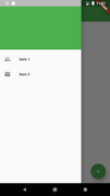
Output:
We can also add icons before the items using the property leading of ListTile, inside which we have to use the Icon widget.
Example:
ListTile(
	title
	: Text('Item 1'),
	leading
	: Icon(Icons.people), ),
	ListTile(
		title
		: Text('Item 2'),
		leading
		: Icon(Icons.mail), ),
Code language: JavaScript (javascript)
Output:
- bottomNavigationBar: bottomNavigationBar is like a menu at the bottom of the Scaffold. We have seen this navigationbar in most of the applications. We can add multiple icons or texts or both in the bar as items.
bottomNavigationBar: BottomNavigationBar(
		currentIndex: 0,
		fixedColor: Colors.green,
		items: const [
		BottomNavigationBarItem(
			label: "Home",
			icon: Icon(Icons.home),
		),
		BottomNavigationBarItem(
			label: "Search",
			icon: Icon(Icons.search),
		),
		BottomNavigationBarItem(
			label: "Profile",
			icon: Icon(Icons.account_circle),
		),
		],
		onTap: (int indexOfItem) {}),
Code language: JavaScript (javascript)
We use BottomNavigationBar widget to display the bar. For the color of active icon, we use the fixedColor property. To add items in the bar we use BottomNavigationBarItems widget, inside which we give text and icon. For the action performed on the tapping on the items, we have onTap(int indexOfItem) function which works according to the index position of the item.
Output: