What is Bootstrap?

Bootstrap is a free and open-source CSS framework that helps you build responsive, mobile-first websites. It includes HTML and CSS-based design templates for typography, forms, buttons, navigation, and other interface components. Bootstrap also includes JavaScript plugins for adding additional functionality, such as dropdown menus, modals, and carousels.
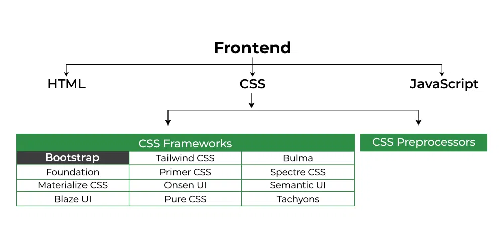
Bootstrap is one of the most popular CSS frameworks in the world. It is used by millions of developers to create websites and web applications. Bootstrap is easy to learn and use, and it is highly customizable. It is also well-documented and has a large community of support.
What are the top use cases of Bootstrap?
Bootstrap is a popular CSS framework that is used to build responsive, mobile-first websites. Here are some of the top use cases of Bootstrap:
- Building websites: Bootstrap is a great choice for building websites of all sizes, from simple landing pages to complex web applications. It is easy to use and customize, and it has a wide range of features that can be used to create a variety of different layouts.
- Creating web applications: Bootstrap can also be used to create web applications. It includes several JavaScript plugins that can be used to add functionality to your applications, such as dropdown menus, modals, and carousels.
- Designing landing pages: Bootstrap is a good choice for designing landing pages. Landing pages are web pages that are designed to convert visitors into customers or leads. Bootstrap’s pre-made templates and components can be used to create attractive and effective landing pages quickly and easily.
- Building forms: Bootstrap includes a number of components that can be used to build forms, such as input fields, checkboxes, and radio buttons. These components are easy to use and customize, and they can be used to create forms that are both functional and attractive.
- Creating buttons: Bootstrap includes a number of button styles that can be used to create buttons that are both stylish and functional. These buttons can be used to add interactivity to your websites and web applications.
- Developing responsive websites: Bootstrap is a responsive framework, which means that it will automatically adjust its layout to fit the size of the screen it is being viewed on. This makes it ideal for creating websites that are accessible on all devices, from desktops to smartphones.
- Creating a design system: A design system is a set of reusable components that can be used to create consistent and cohesive user interfaces. Bootstrap can be used to create a design system by using its pre-made components and templates.
What are the features of Bootstrap?
Bootstrap is a popular CSS framework that is used to build responsive, mobile-first websites. It includes HTML and CSS-based design templates for typography, forms, buttons, navigation, and other interface components. Bootstrap also includes JavaScript plugins for adding additional functionality, such as dropdown menus, modals, and carousels.
Here are some of the features of Bootstrap:
- Responsive: Bootstrap is responsive, which means that it will automatically adjust its layout to fit the size of the screen it is being viewed on. This makes it ideal for creating websites that are accessible on all devices, from desktops to smartphones.
- Mobile-first: Bootstrap is mobile-first, which means that it is designed to be used on mobile devices first. This makes it ideal for creating websites that are optimized for mobile devices.
- Customizable: Bootstrap is highly customizable. You can change the colors, fonts, and other aspects of the framework to match your branding.
- Well-documented: Bootstrap is well-documented. The documentation is clear and concise, and it includes examples of how to use the framework.
- Large community: Bootstrap has a large community of support. There are many forums and blogs where you can ask questions and get help from other developers.
- Free and open-source: Bootstrap is free and open-source software. This means that you can use it for free and you can modify it to fit your needs.
What is the workflow of Bootstrap?
Sure. Here is the general workflow of Bootstrap:
- Download Bootstrap: The first step is to download Bootstrap. You can download it from the Bootstrap website.
- Install Bootstrap: Once you have downloaded Bootstrap, you need to install it. You can install it using a package manager, such as npm or yarn.
- Configure Bootstrap: Once you have installed Bootstrap, you need to configure it. This involves adding Bootstrap CSS and JavaScript files to your HTML file.
- Use Bootstrap components: Once you have configured Bootstrap, you can start using the Bootstrap components. You can use the Bootstrap components to create your website or web application.
- Customize Bootstrap: You can customize Bootstrap to match your branding. You can change the colors, fonts, and other aspects of the framework.
How Bootstrap Works & Architecture?
Bootstrap is a front-end framework that consists of HTML, CSS, and JavaScript. It helps developers create responsive, mobile-first websites and web applications. Bootstrap works by using a 12-column grid system to create layouts that are both responsive and mobile-friendly. The grid system is based on Flexbox, which makes it easy to create layouts that are both flexible and efficient. Bootstrap also includes a number of pre-made components, such as buttons, forms, and navigation bars. These components can be used to create websites and web applications quickly and easily.
Bootstrap’s architecture is based on the following layers:
- The core: The core layer includes the 12-column grid system, the pre-made components, and the JavaScript plugins.
- The utilities: The utilities layer includes a set of classes that can be used to style your HTML elements.
- The themes: The themes layer includes a set of pre-made themes that can be used to change the look and feel of your websites and web applications.
How to Install and Configure Bootstrap?
Installing and configuring Bootstrap involves a few simple steps. Bootstrap provides different ways to include its CSS and JavaScript files, depending on your project’s needs. Here’s how you can install and configure Bootstrap:
1. Installation Methods:
There are a few ways to install Bootstrap:
Using a CDN (Content Delivery Network):
You can include Bootstrap directly from a CDN by adding the following lines to your HTML file’s section:
<!-- Add this in the <head> section of your HTML -->
<link rel="stylesheet" href="https://cdn.jsdelivr.net/npm/bootstrap@5.5.0/dist/css/bootstrap.min.css">
<script src="https://cdn.jsdelivr.net/npm/bootstrap@5.5.0/dist/js/bootstrap.bundle.min.js"></script>Code language: HTML, XML (xml)
Downloading and Hosting Locally:
You can download the Bootstrap files from the official website and host them on your server. Download the CSS and JavaScript files from the following URLs:
CSS: https://getbootstrap.com/docs/5.5/dist/css/bootstrap.min.css
JavaScript: https://getbootstrap.com/docs/5.5/dist/js/bootstrap.bundle.min.js
2. Configuration:
Once you’ve included Bootstrap in your project, you can start using its components and features. Here’s how you can configure Bootstrap components:
- HTML Structure:
Set up your HTML structure with appropriate containers, rows, and columns using Bootstrap’s grid system.
- Component Classes:
To use Bootstrap components, add the relevant CSS classes to your HTML elements. For example, to create a button, you can use the following code:
<button class="btn btn-primary">Click Me</button>Code language: HTML, XML (xml)- Responsive Design:
Use the responsive grid system to organize your content into rows and columns. Apply the container, row, and col-* classes to create responsive layouts.
- Customization:
If you want to customize Bootstrap’s default styling, you can override its variables. Bootstrap provides a customization guide on its official website that walks you through the process.
- JavaScript Components (Optional):
If you’re using JavaScript-powered components like modals or tooltips, include the required JavaScript files and initialize the components using JavaScript code.
3. Testing and Integration:
After configuring Bootstrap, thoroughly test your project to ensure that the components and styles work as expected across different devices and screen sizes.
4. Maintenance and Updates:
Keep an eye on Bootstrap’s official website for updates and new releases. When updating, make sure to test your project with the new version to ensure compatibility.